3 min read
How to Create Beautiful and Dynamic Pages in Confluence Cloud
 Alma Dizdaric
:
Apr 5, 2022 2:00:00 PM
 Confluence is one of the most important team workspaces your organization will ever use. Your team can share work, organize vital information and retain and share your most critical institutional knowledge. If you use your instance regularly, your Confluence pages and spaces become a suppository for all of the knowledge your workers have gained as individuals and as a collective - ready to be accessed for the benefit of new employees or even clients.We say if you use your instance regularly because we know that that's not always the case.
You may spend hours crafting and fine-tuning your Confluence pages and find that your teams still waste time looking for the answers everywhere except your wiki. Often, the problem doesn't lie with Confluence or your content. It's the way it's used or presented.
A few simple macros can turn your lifeless (and lengthy) Confluences pages into engaging and easy-to-digest content hubs that your teams will come to rely on every day.
Why You Should Create More Engaging Confluence Pages
If you've been using Confluence for a while, you may wonder whether it's worth taking the effort to restructure or tweak the layouts of your content. But there are several compelling benefits to creating more engaging Confluence pages:
It organizes your content in a way that makes it more user-friendly
If you work on software or technical projects, your Confluence pages can become hard to maintain (and read!) over time. When documents become text-heavy and overly long, users start storing their documents in different locations or find it much harder to skim through the copy to find what they are looking for. A few time-saving macros (like a table of contents) and best design practices (like utilizing white space and attractive templates) can save a lot of time in the long run.
It makes it easier to collaborate
Confluence comes with a collaborative editor so that team and stakeholders can discuss, make comments or create release notes. If the content is structured well, engaging, and easy to navigate, collaboration and knowledge-sharing will automatically increase.
It improves transparency
For agile teams with big projects that need to stay in touch and in sync, Confluence can be a life-saver. Jira templates can be used to generate reports, which can be turned into time-saving Confluence pages. However, it can be hard to find the information you are looking for if it's not well-organized. Reduce the duplication of efforts and give your team access to the information they need through easy-to-use templates and macros.
How to Create More Engaging Confluence Pages
Creating more engaging pages is easy if you use either the built-in (native) Confluence macros or third-party macros found in Marketplace. Macros are add-ons that can be used to extend the functionality of your Confluence pages. It takes a little getting used to, but once you have the hang of it, they are easy to implement.

Provide breathing space
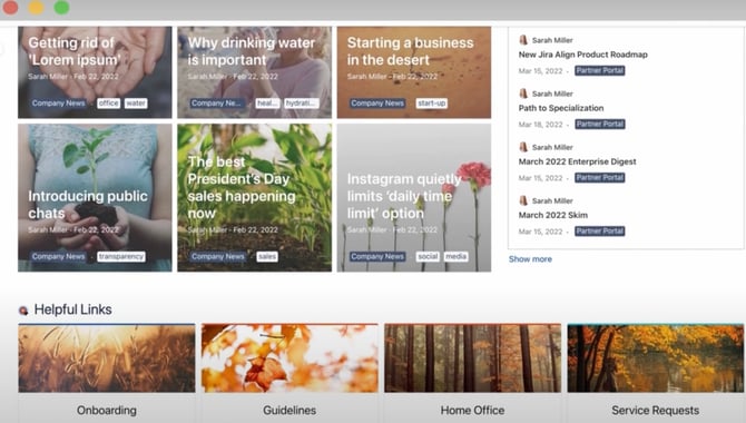
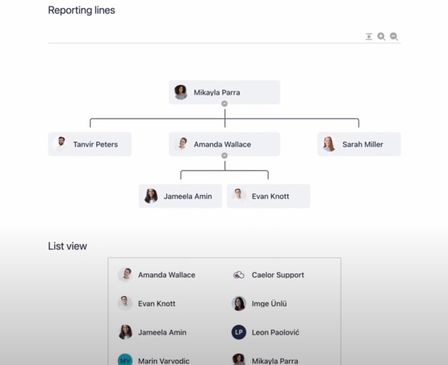
Too much text is overwhelming for everyone, especially technical documents spanning dozens of pages. Create white space with formatting macros like dividers, cards, or columns, or display key facts in quotes to catch the readers' attention. PageBuilder from MacroSuite comes highly recommended as you can structure your pages from scratch with simple drag-and-drop tools or use a pre-built template.
Clear the chaos
You can use macros to break up long paragraphs or unsightly page links without losing any of the information contained within. Customized buttons, tabs, footnotes, and tables of content make it much easier for users to find what they are looking for in Confluence.
Use color to liven up your pages
Sometimes you can't avoid being text-heavy, but you can always avoid dull and intimidating-looking pages by adding pops of color, backgrounds, banners, or icons that break up the monotony. Just don't go overboard with too many clashing colors, as your pages will feel cluttered. Content Viz macros contain powerful visualization tools and templates if you need a little inspiration.
Show don't tell
Our brains can process visual information the best (and retain visual information much longer). You can use images and videos in backgrounds or banners to engage your audience or compile your more complex information into charts and infographics through the Chart or Diagram macros.

Foster an emotional, personal connection
Use your macros to add emojis, GIFs, videos, or animations. You can also display social feeds, Google Maps, YouTube, and simple Lottie animations via Page Builder to foster a more personal connection to your teammates.
Additional Tips
- Always start out with templates. If you are new to Confluence macros, templates are an efficient and easy way to get started and get the hang of creating pages. It provides a structure that really works. Once you've become more adept at using the tools, you can use a blank canvas.
- Use page layouts. It's the easiest way to structure your content, and you can always make changes or move things around at a later stage.
- Always use visuals wherever possible. Content is a lot more engaging when an image or graph is attached. Use wireframes, mockups, graphs, or even stock photos from the library to make your content stand out.
- If you are an admin, you can see how often macros are being used by going to General Configuration: Macro usage.
Confluence is an extremely useful tool if it's well-structured and engages its readers. If you want to get the most from your Confluence pages, you have to start using macros to revitalize your content.


